Contents
What the dashboard shows during a live race
A live F1 dashboard is not just a leaderboard.
It is a way of seeing the race unfold in layers.
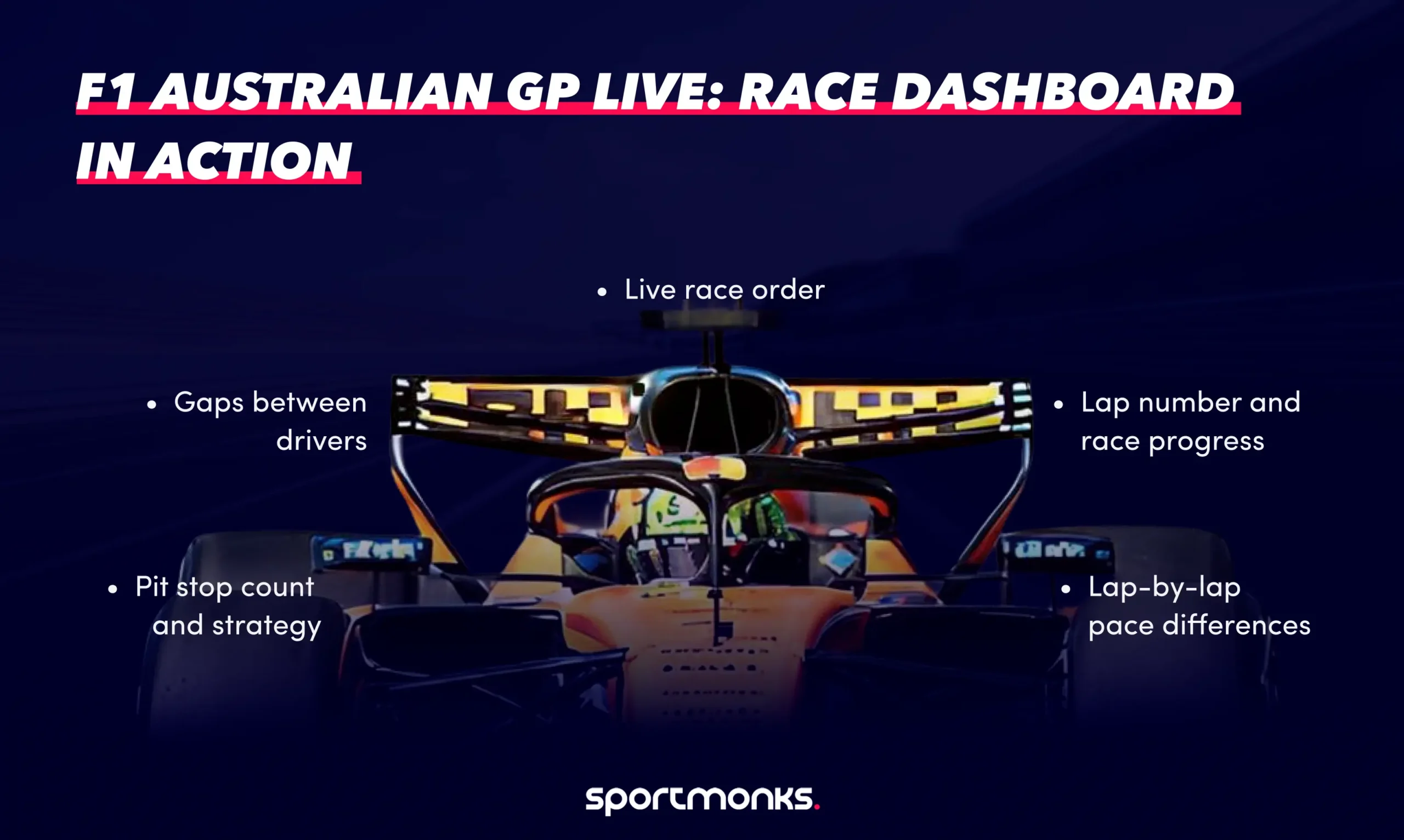
At any moment during the Australian Grand Prix, your dashboard should show:
– the current race order
– gaps between drivers
– lap number and race progress
– pit stop count and strategy
– lap-by-lap pace differences
This is the same data structure used in official live timing tools, which track driver positions, lap times, sector performance, and tyre usage in real time.
The difference is how you present it.
Lap one to lap ten: the race stabilises
The opening phase in Melbourne is always chaotic.
Heavy braking into Turn 1, cold tyres, and 20 cars arriving at the same point at once. In 2026, the lead changed multiple times in the opening laps as Russell and Leclerc traded positions early.
On a dashboard, this is where live leaderboard updates matter most.
Positions change corner by corner. Time gaps are unstable. A static race table does not capture that.
A real-time dashboard does.
This is typically powered by:
– livescores endpoint for session state
– results data for current order
– lap data for timing updates
The goal is simple: reflect the race as it is happening, not as it was a lap ago.
The middle stint: where strategy takes over
Once the race settles, the focus shifts.
Not to overtake, but to strategise.
The Australian Grand Prix was shaped by:
– Virtual Safety Car timing
– tyre degradation across long stints
– the choice between one-stop and two-stop strategies
This is where your dashboard needs to go beyond the leaderboard.
You need to see:
– When each driver pits
– How long do they stay out
– how their lap times change before and after stops
Lap data and pit stop data combined give you that picture.
For example:
A driver running consistent laps, then suddenly dropping two seconds, is either:
– managing tyres
– hitting traffic
– or preparing to pit
Without lap data, you do not see it coming.
Pit stops: the turning point
In Melbourne, strategy windows define the race.
A well-timed stop under a Safety Car or Virtual Safety Car can gain multiple positions instantly.
The 2026 race saw strategy decisions under VSC conditions directly impact the final order, particularly among the leading teams.
On a dashboard, this shows up as:
– pit stop markers on lap charts
– sudden position drops and recoveries
– changing gap patterns
This is why pit stop data is not optional.
It is the explanation layer for everything that happens on the track.
The final stint: pace versus track position
The closing laps of the race are usually defined by one question:
Who still has pace?
Russell controlled the final stint on ageing tyres, holding a gap of just under three seconds to secure the win.
Behind him, the gaps stabilised. Norris and Verstappen, for example, were separated but not close enough for a late challenge.
This is where a lap-by-lap comparison becomes critical.
A good dashboard shows:
– last lap time
– average stint pace
– gap evolution over the final laps
Instead of just seeing “+2.9s”, you see whether that gap is:
– increasing
– stable
– or closing
What the full race looks like through a dashboard
When you combine all layers, the race becomes easier to read.
Not simpler, but clearer.
From the Australian Grand Prix, your dashboard would show:
– Russell is leading with a controlled pace.
– Antonelli is maintaining a consistent gap.
– Ferrari is losing time during key strategy windows.
– Midfield battles are shaped by pit timing rather than overtakes
– Retirements and DNFs are reshaping the lower order.
A full live dashboard, like those used in modern F1 tools, often includes:
– real-time standings
– head-to-head pace comparisons
– pit stop analysis
– tyre and stint tracking
Each layer answers a different question.
Translating the race into your own dashboard
Using the Sportmonks Motorsport API, this race maps cleanly into data.
You would typically pull:
– fixtures → identify the Australian GP
– livescores → detect when the race is active
– laps → track pace and timing
– pitstops → track strategy
– standings → update post-race results
Each endpoint represents one part of the race story.
Combined, they recreate the full race narrative.
What Melbourne reveals about real-time dashboards
Albert Park is not the easiest circuit to analyse.
The track evolves quickly across the weekend, grip levels change, and strategy windows are heavily influenced by interruptions.
The circuit runs 5.278 km and typically rewards cars with strong balance and responsiveness rather than pure straight-line speed.
That makes it a perfect test case.
If your dashboard works for Melbourne, it will work anywhere.
Using the Sportmonks API to power your own live dashboard
Everything described above can be built directly using the Sportmonks Motorsport API.
The API is designed specifically for motorsport data, with endpoints that reflect how races actually unfold. It provides real-time race updates, lap-by-lap timing, pit stops, and detailed session data through a REST API with JSON responses.
A typical live dashboard setup looks like this:
- fixtures endpoint → identify the Australian Grand Prix
- livescores endpoint → detect when the race is live
- laps endpoints → track lap timing and pace
- pitstops endpoints → track race strategy
- results data → build the live leaderboard
The livescores endpoint returns all fixtures currently in progress and can include lap data, pit stops, and race metadata in a single request.
Lap endpoints provide sector times and full lap duration, allowing detailed analysis of driver pace.
Pit stop endpoints return every stop made during the race, including lap number and timing, allowing full strategy tracking.
Put together, these endpoints recreate the race in real time.
Not just the order, but the story behind it.